
Kester
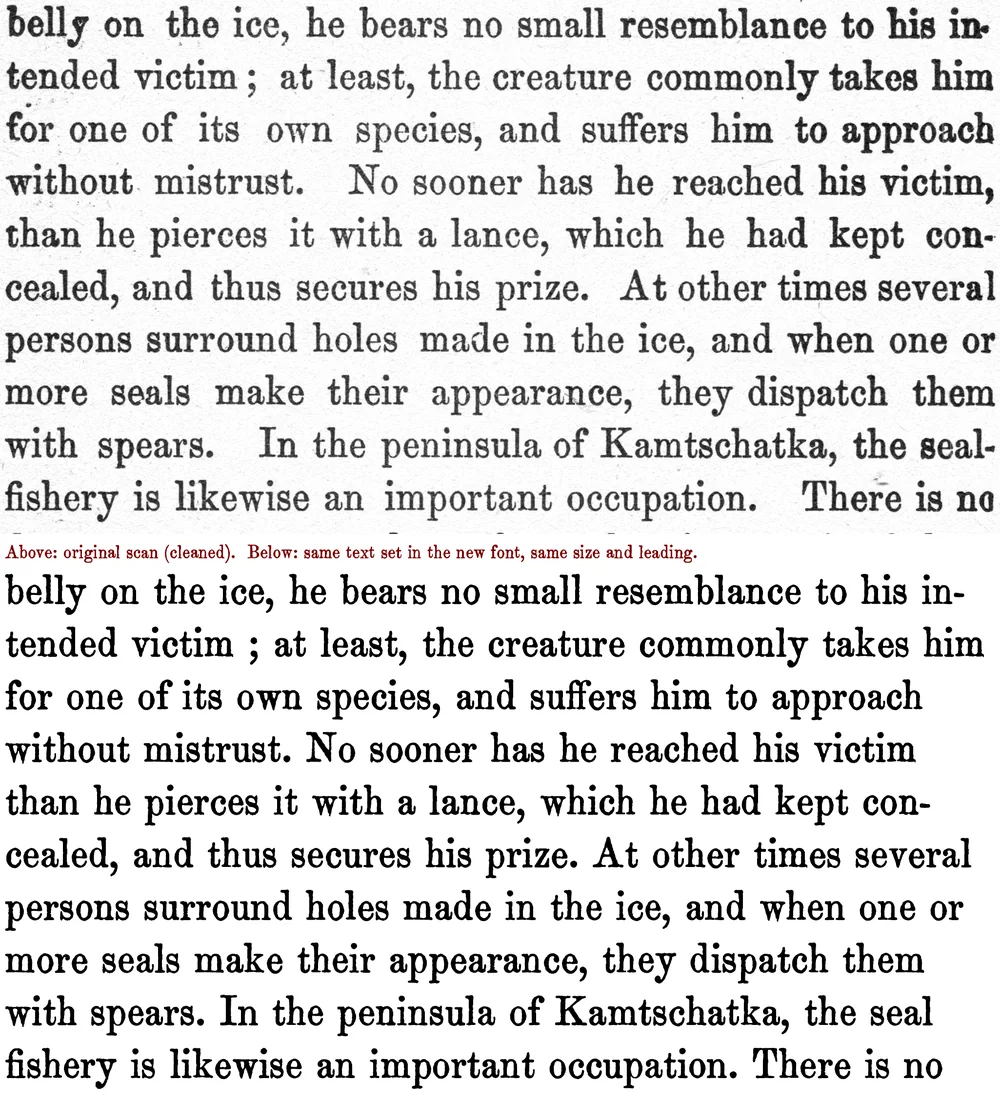
A free letterpress serif traced letter by letter from an 1890s American travel book, ink spread and all, with four printed versions of every lowercase letter.
- Era
- Victorian (1837–1901)
- Source
- Adventures of Famous Travellers in Many Lands, c. 1893–1894
- Original type
- Ronaldson Old Style (probable)
MacKellar, Smiths & Jordan, Philadelphia, 1884 - Best for
- Text face
- Characters
- 94 · 225 glyphs
- Features
- Letter variants, ligatures
- Version
- 0.100 · November 20, 2026
- License
- SIL Open Font License
- Downloads
- 0
OTF + TTF · 189 KB zip · Free for personal & commercial use
Try it in the type tester PDF type specimen · 2.0 MB Cite this fontFree and open source. A link back to antiquefonts.com is greatly appreciated, and we’d love to see what you make: [email protected].
Try Kester
Type anything below, or pick a sample.
- 14 PX
- 18 PX
- 24 PX
- 36 PX
- 48 PX
Each letter rotates through the printed versions found in the book, so repeated letters never look identical. Characters Kester doesn’t include will show in a fallback font.
About Kester
Kester comes from the pages of Adventures of Famous Travellers in Many Lands, a cheap 1890s anthology of seal hunts, bullfights and buffalo chases, printed on pulp paper in a sturdy old style type, most likely Ronaldson Old Style from 1884. Every letter was scanned at 1200 dpi and traced from a real impression on the page, so the font keeps the book's heavy ink, worn edges and gentle baseline wobble. Up to four different printed copies of each letter rotate automatically as you type, so words look set by hand, not stamped from one die.
The source
- Title
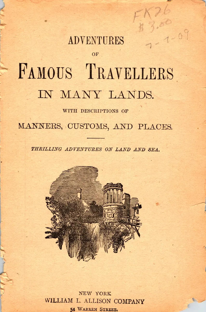
- Adventures of Famous Travellers in Many Lands. With Descriptions of Manners, Customs, and Places
- Running head
- “The Romance of Travel”
- Publisher
- William L. Allison Company
- Place
- New York
- Date
- c. 1893–1894
- Type
- Book
- Original size
- 11 pt (Small Pica) on 13 pt leading
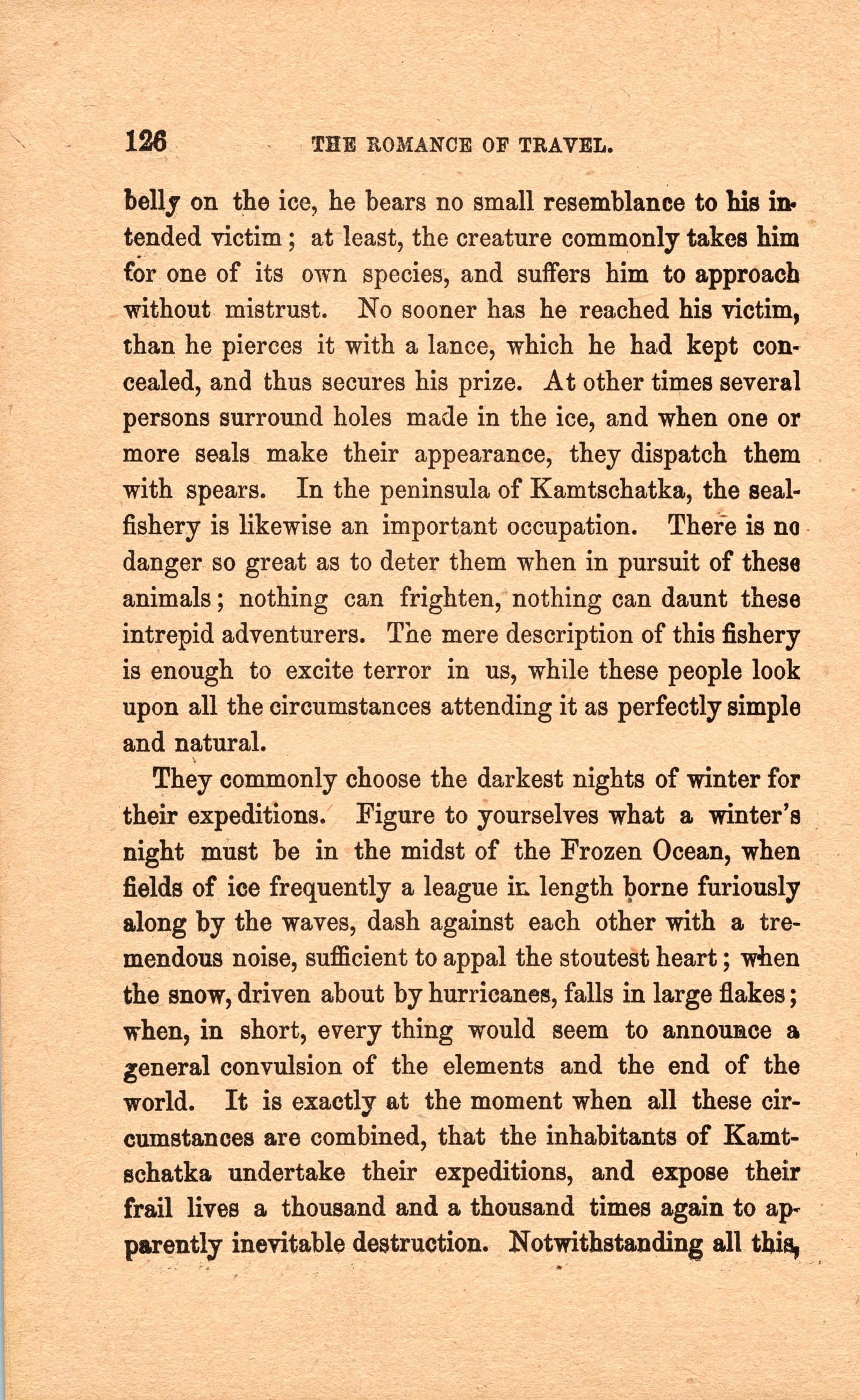
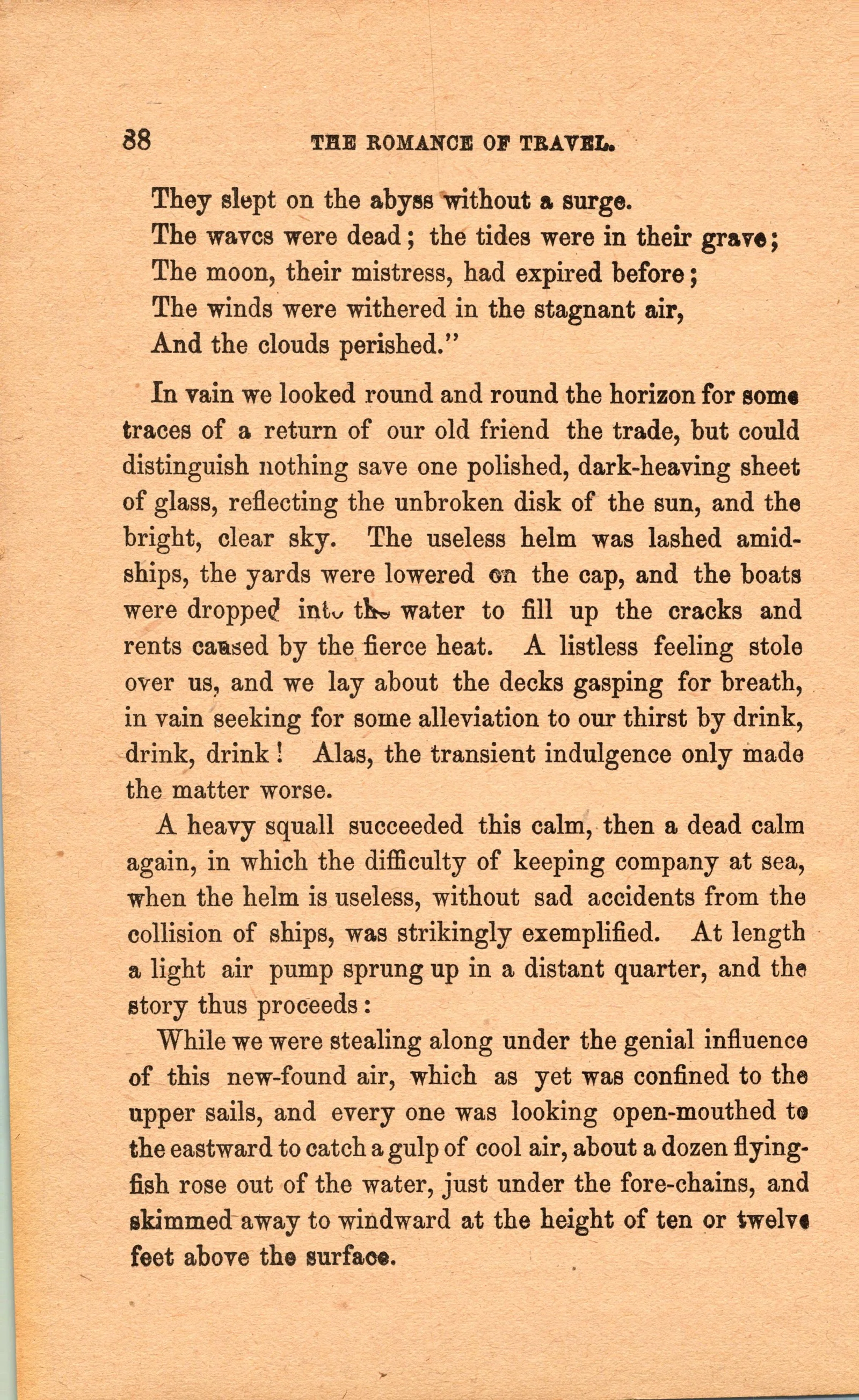
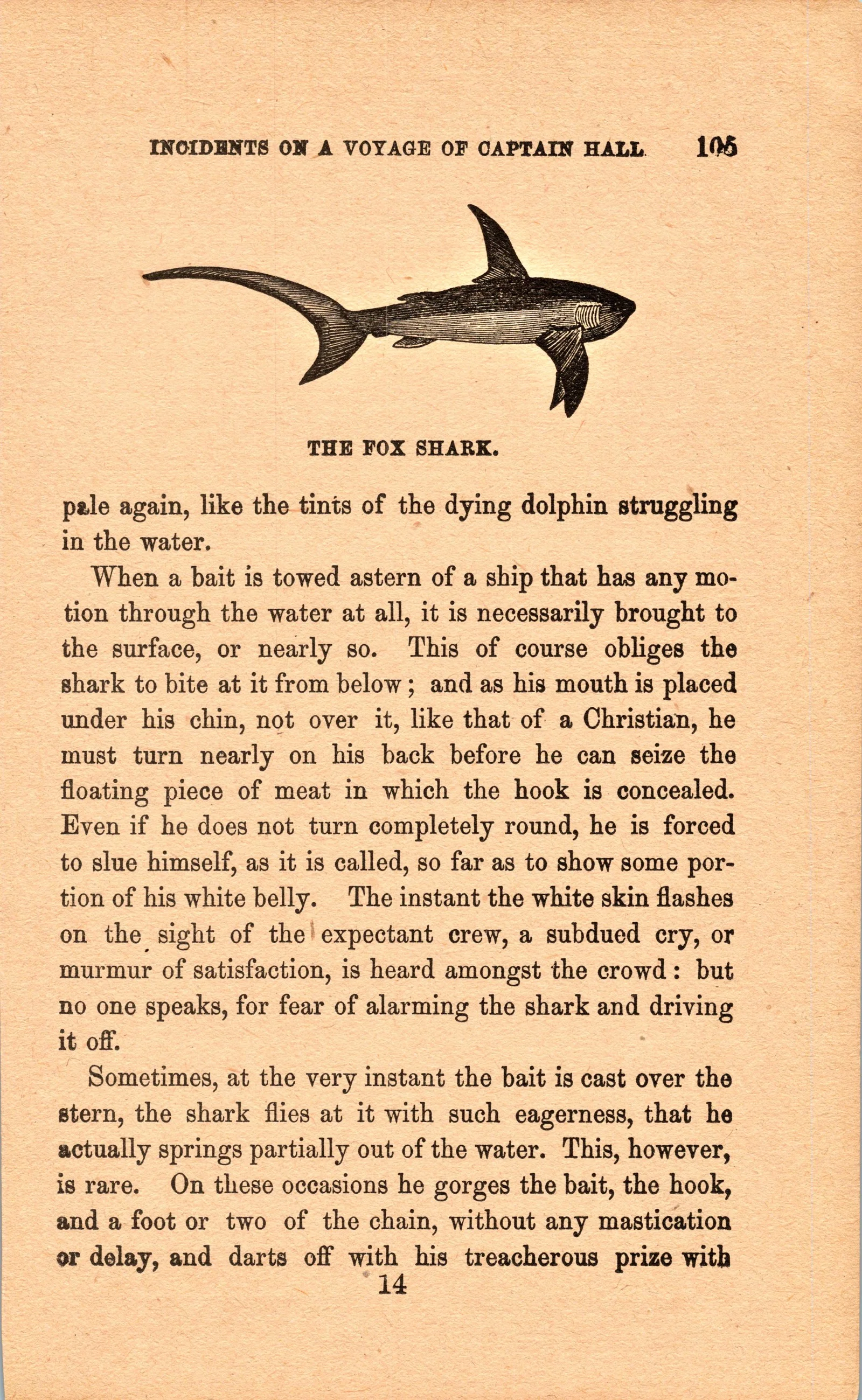
A cheap anthology of travel sketches and adventure stories, sold in a paper cover. The text is printed letterpress on pulp paper that has since yellowed, which is where Kester's heavy ink spread and rough edges come from. Inside, the pages carry the running head "The Romance of Travel." Chapters sampled for the font include "Seal Hunting among the Greenlanders," "Mr. Lewis in Jamaica," "Spain and the Bull Fights," "Excitements of Buffalo Hunting" and "Incidents on a Voyage of Captain Hall."
See the cover and 108 engravings from this book on AntiqueAdvertisements.com
- Pages scanned83, at 1200 dpi
- Text pages used52, plus 11 illustration pages for caption capitals
- Letters measured61,367
- Pages the final glyphs come from47
From the book
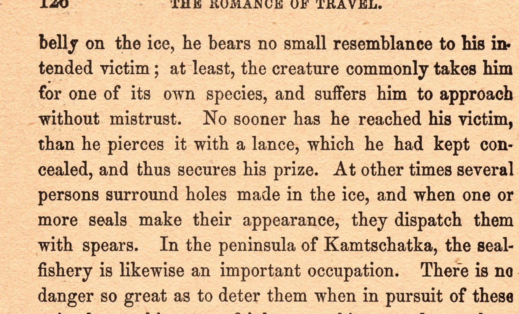
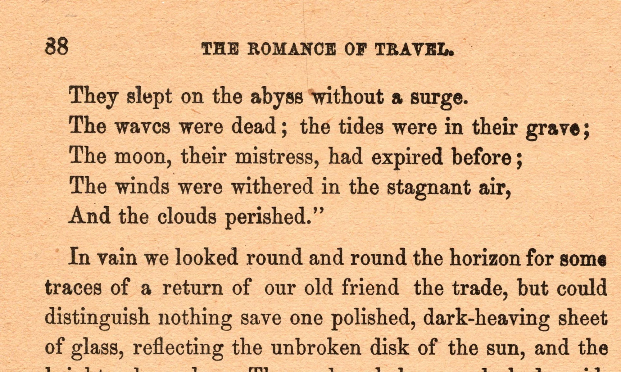
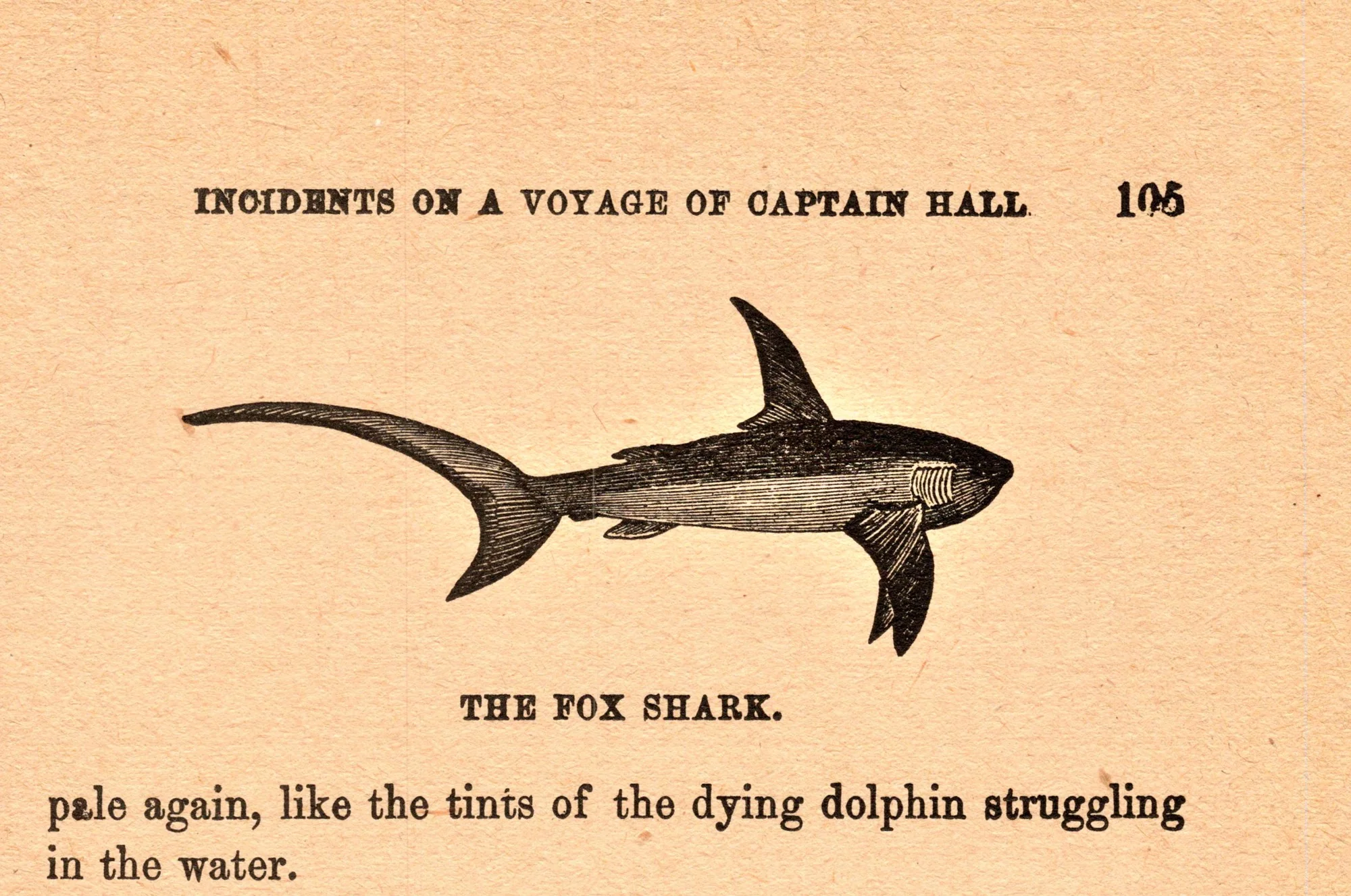
Pages from the original, straightened and evenly lit. Select a page to see it full size.
Letter variants
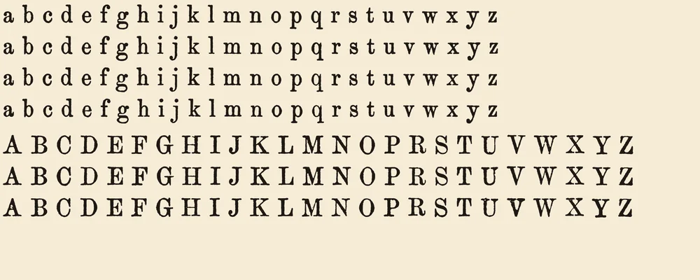
Four printed versions of every lowercase letter and three of every capital (one each of X and Z, since only one usable example survives in the book). Each variant comes from a different page and was checked against its main letter's weight.
| Feature | What it does | On by default |
|---|---|---|
| Contextual Alternates (calt) | Cycles each letter through its printed versions, based on the letter before it | Yes |
| Standard Ligatures (liga) | fi, ff, fl and ffi joined as in the book | Yes |
| Stylistic Set 1 (ss01) | Switches every letter to its 2nd version | No |
| Stylistic Set 2 (ss02) | Switches every letter to its 3rd version | No |
| Stylistic Set 3 (ss03) | Switches lowercase to its 4th version (capitals have 3) | No |
Character set
94 characters and 225 glyphs, counting the letter variants and ligatures. Select a character to try all its versions in the tester.
Not included
- Accented letters (é è à ñ ü ç and others): Kester is for English text only
- § ¶ † ‡ (section and footnote marks)
- £ ¢ ½ ¼ ¾ © ° + = ×
- The ffl ligature
- Bold and italic styles
If you type a character Kester doesn't have, your app borrows it from another font.
Where each glyph came from
206 of Kester's 221 drawn glyphs are real impressions from the book. The other 15 were rebuilt because the book never prints them; drawn parts use stroke widths measured from the real letters and the same mottled ink texture.
- Straight from the book's body text
- a–z, A–W and Y, 0–9, . , ; : ! ? ‘ ’ “ ” ( ) [ ] & - —, the ligatures fi ff fl ffi, and every lowercase variant
- From smaller capitals in captions and running heads, scaled to text size
- X (from "Exterior"), Z (from "Alguazil"), two variants of U and one of V
- Rebuilt from the book's own printed parts
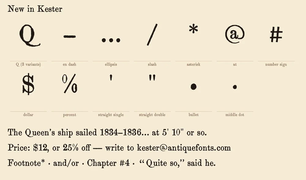
- Q (the book's O with a drawn tail), – en dash (both ends of the em dash), … ellipsis (three real periods), • and · (real periods, raised), $ (the book's S with a drawn bar), % (the book's zeros), @ (the book's a with a drawn ring)
- Drawn to match
- / slash, * asterisk, # number sign, straight ' and "
How it was made
Nearly every glyph is a real impression from the page, not a redrawing. Instead of averaging many copies of a letter into one clean shape, the process picks the single most typical real example, so each glyph keeps its own ink spread, nicks and slight tilt.
- Scanned each page at 1200 dpi, straightened it and evened out the paper tone.
- Read the text with OCR and split every word into its individual letters, checking that each word split into the right number of letters.
- Measured each line's baseline, so every letter keeps its true height, including the small up-and-down wobble of hand-set type.
- For each character, ranked thousands of real examples and picked the most typical one, plus up to three more from different pages for the variants.
- Traced each chosen letter into smooth vector outlines at the scan's full resolution.
- Measured the gaps between letters across the whole book and solved for each letter's spacing, so words space the way the original type did.
- Checked every glyph by eye, including the weight of each variant against its main letter.
More about how the fonts are made
Historical note
The original type is most likely Ronaldson Old Style, designed and cut in 1884 by Alexander Kay for the Philadelphia type foundry MacKellar, Smiths & Jordan, or one of the copies other foundries made of it.1 The clues are the beaked top serifs on i, m, n, v and w, a y whose tail curls into a ball, an h whose right leg curls inward, an R whose leg ends in an upturned flick, and sturdy, low-contrast strokes suited to fast, cheap book printing. Our confidence is moderate: the letters have not yet been checked one by one against a printed foundry specimen.
Kay was a Scottish punchcutter who had cut type in London for the punchcutter John Skirving before joining the Philadelphia foundry L. Johnson & Co. in 1854, where he changed his name from MacKaye to Kay. His best-known faces are Binny Old Style and Ronaldson Old Style.2 The Ronaldson name honours James Ronaldson, one of the founders of the foundry's predecessor, Binny & Ronaldson.3 By the time the face appeared, MacKellar, Smiths & Jordan was the largest type foundry in America; in 1892 it was merged with many others into American Type Founders.4
The book's publisher, the William L. Allison Company, was an important New York publisher of inexpensive books in the 1880s and 1890s, and kept publishing until 1899.5 The cheap pulp paper of this copy fits an 1880s or 1890s printing, and it is the paper, soaking up the ink, that gives Kester its heavy, spread letterforms.
Sources
- Ronaldson, Fonts In Use
- Alexander Kay, MyFonts
- MacKellar, Smiths and Jordan, Luc Devroye, Type Design Information Page
- Binny and Ronaldson, MyFonts
- Publisher: William L. Allison, New York, 1869–1899, The Lucile Project, University of Iowa
Printable type specimen
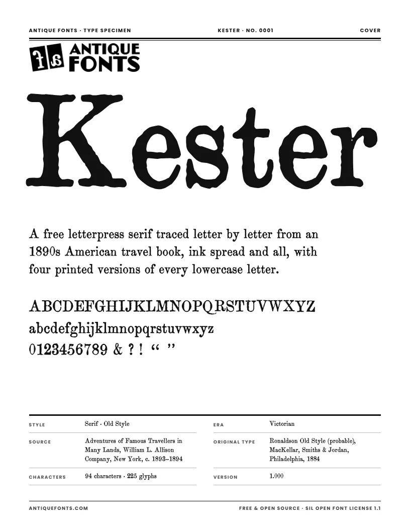
A six-page specimen of Kester to print or keep: the full character set, every printed version of each letter, text set at the size used in the original book, and the story of its source.
US Letter, ready to print.
Specifications
- Formats
- OTF (CFF outlines) and TTF
- Units per em
- 1000
- x-height / cap height
- 441 / 696
- Default line spacing
- 1.18 em, matching the book's 11 on 13 pt
- Kerning
- None, as in the original metal type; spacing is measured from the book
- Best sizes
- 9–14 pt for text that looks like the book; at display sizes the ink texture becomes the feature
- Version
- 0.100
- Released
- November 20, 2026
In the download
- Kester-Regular.otf (138 KB)
- Kester-Regular.ttf (186 KB)
- OFL.txt (the license)
- README.txt
License
Free · Open source · SIL Open Font License 1.1
Kester is free for personal and commercial use. Use it in logos, books, packaging, websites, apps, videos, anything. You may share it, change it and bundle it with your own work.
The only thing you can’t do is sell the font files on their own. Changed versions must stay under the same license.
Credit isn’t required, but a link back to antiquefonts.com is greatly appreciated. And if you make something with Kester, we’d love to see it: email [email protected].
Questions
- Can I use Kester commercially?
- Yes. Kester is free for personal and commercial projects: logos, books, packaging, websites, anything. The one thing you can't do is sell the font files themselves.
- Why do the letters look rough?
- On purpose. Every glyph is a real impression from 19th-century letterpress printing, with the imperfections kept.
- Why does the same letter look different each time?
- Kester rotates through three or four printed versions of each letter. Turn off Contextual Alternates in your app to use only the main version.
- Is every character original?
- Almost. 206 glyphs come straight from the book; the Q, a few symbols and some punctuation the book never printed were rebuilt from its own letters or drawn to match. The full list is above.
- Does it support accents or other languages?
- No. Kester covers English text only, like the book it comes from, and accented letters are not planned.
- Which apps show the letter variants?
- Any app with OpenType support: Adobe Illustrator, InDesign and Photoshop, Affinity, Figma and recent versions of Word. In Illustrator, open Window › Type › OpenType, or select a single letter to pick a variant from the pop-up beneath it. Apps without OpenType support show only the main version of each letter.
Cite this font
Kester (version 0.100). Font digitized by AntiqueFonts.com from Adventures of Famous Travellers in Many Lands (New York: William L. Allison Company, c. 1893–1894). AntiqueFonts.com, no. 0001. https://antiquefonts.com/fonts/kester/