Plumb Bob
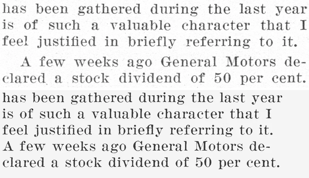
A free 1920s newspaper serif traced letter by letter from The Carpenter, the union magazine of America’s carpenters, with up to four printed versions of every letter.
- Style
- Serif · Slab Serif
- Era
- Art Deco (c. 1920–1930)
- Source
- The Carpenter, December 1926 and September 1927
- Original type
- Ionic No. 5 (probable)
Mergenthaler Linotype Company, Brooklyn, 1925 - Best for
- Text face
- Characters
- 94 · 221 glyphs
- Features
- Letter variants, ligatures
- Version
- 1.000 · November 21, 2026
- License
- SIL Open Font License
- Downloads
- 0
OTF + TTF · 175 KB zip · Free for personal & commercial use
Try it in the type tester PDF type specimen · 1.4 MB Cite this fontFree and open source. A link back to antiquefonts.com is greatly appreciated, and we’d love to see what you make: [email protected].
Try Plumb Bob
Type anything below, or pick a sample.
- 14 PX
- 18 PX
- 24 PX
- 36 PX
- 48 PX
Each letter rotates through the printed versions found in the magazine, so repeated letters never look identical. Characters Plumb Bob doesn’t include will show in a fallback font.
About Plumb Bob
Plumb Bob comes from two issues of The Carpenter, the monthly journal of the United Brotherhood of Carpenters and Joiners of America, from December 1926 and September 1927. Its pages of union news, editorials and roof-framing lessons were set in a wide, sturdy newspaper serif, most likely Linotype’s Ionic No. 5 from 1925. Every letter was scanned at 1200 dpi and traced from a real impression on the page, keeping the grey ink, soft edges and slight unevenness of fast magazine printing. Up to four different printed copies of each letter rotate automatically as you type.
The source
- Title
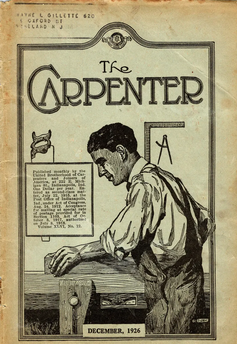
- The Carpenter. Official Journal of the United Brotherhood of Carpenters and Joiners of America
- Publisher
- United Brotherhood of Carpenters and Joiners of America
- Place
- Indianapolis
- Date
- December 1926 and September 1927
- Type
- Magazine
- Original size
- 8 pt on 9 pt lines
The monthly journal of America’s carpenters' union, published on the 15th of each month at the Carpenters' Building in Indianapolis and edited by Frank Duffy. A year’s subscription cost one dollar. Each issue mixed union business, editorials, correspondence and a "Craft Problems" section of roof-framing and stair-building lessons, wrapped in pages of advertising for saws, planes, levels and wallboard. Articles sampled for the font include "The Five Day Week" by John Frey, the Editorial and Official Information pages, and Craft Problems.
See the December 1926 cover, masthead and decorated initials on AntiqueAdvertisements.com
- Pages scanned164 (two issues), at 1200 dpi
- Text pages used66
- Letters measured52,918
- Pages the final glyphs come from35
From the magazine
Pages from the original, straightened and evenly lit. Select a page to see it full size.
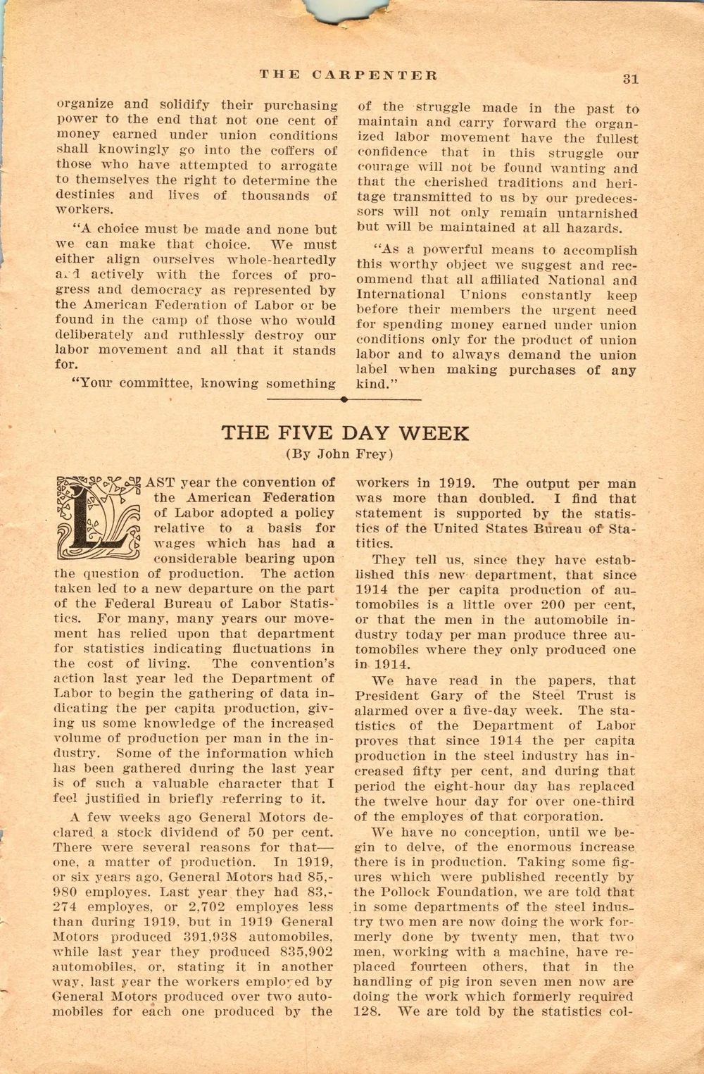
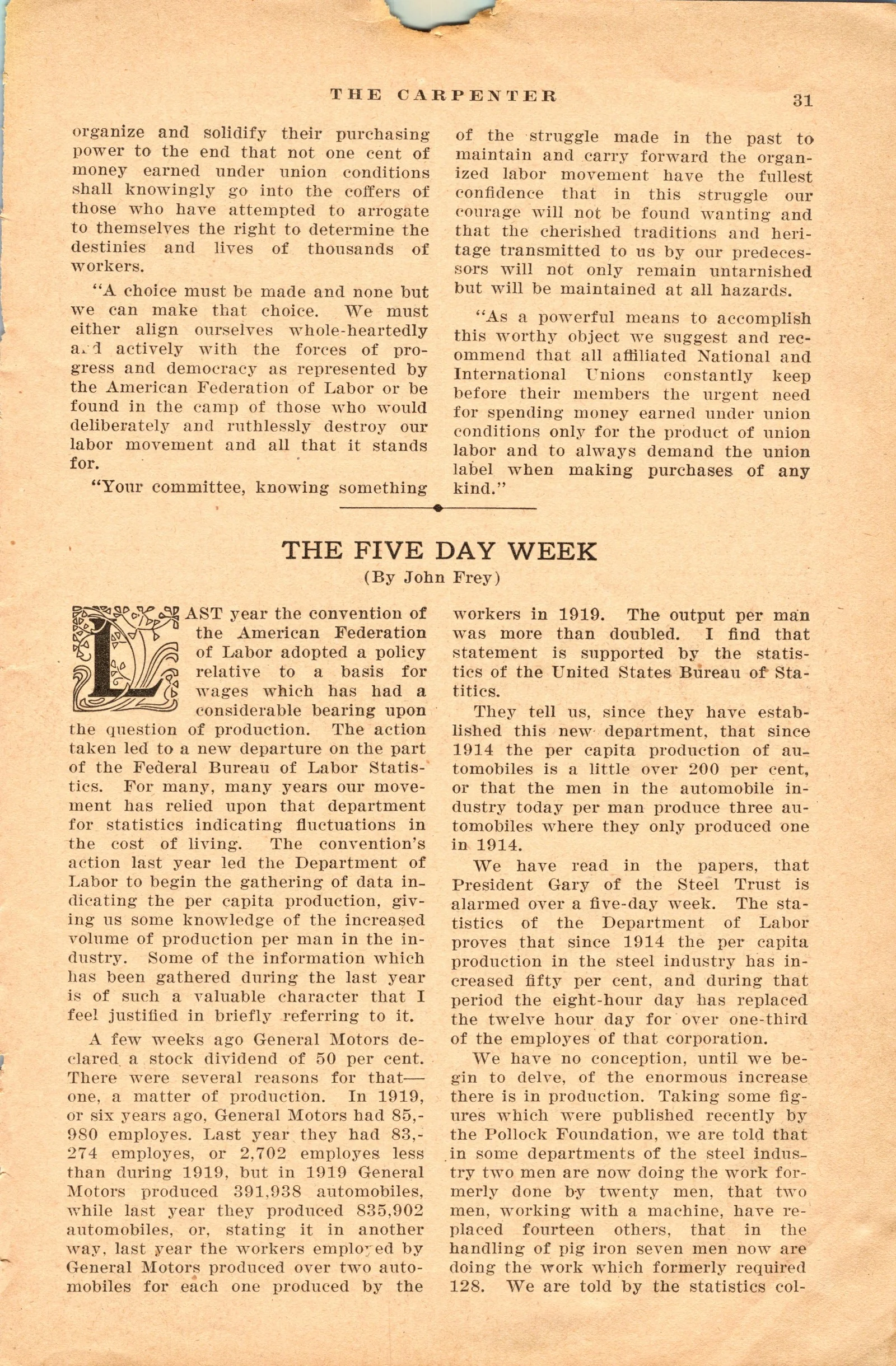
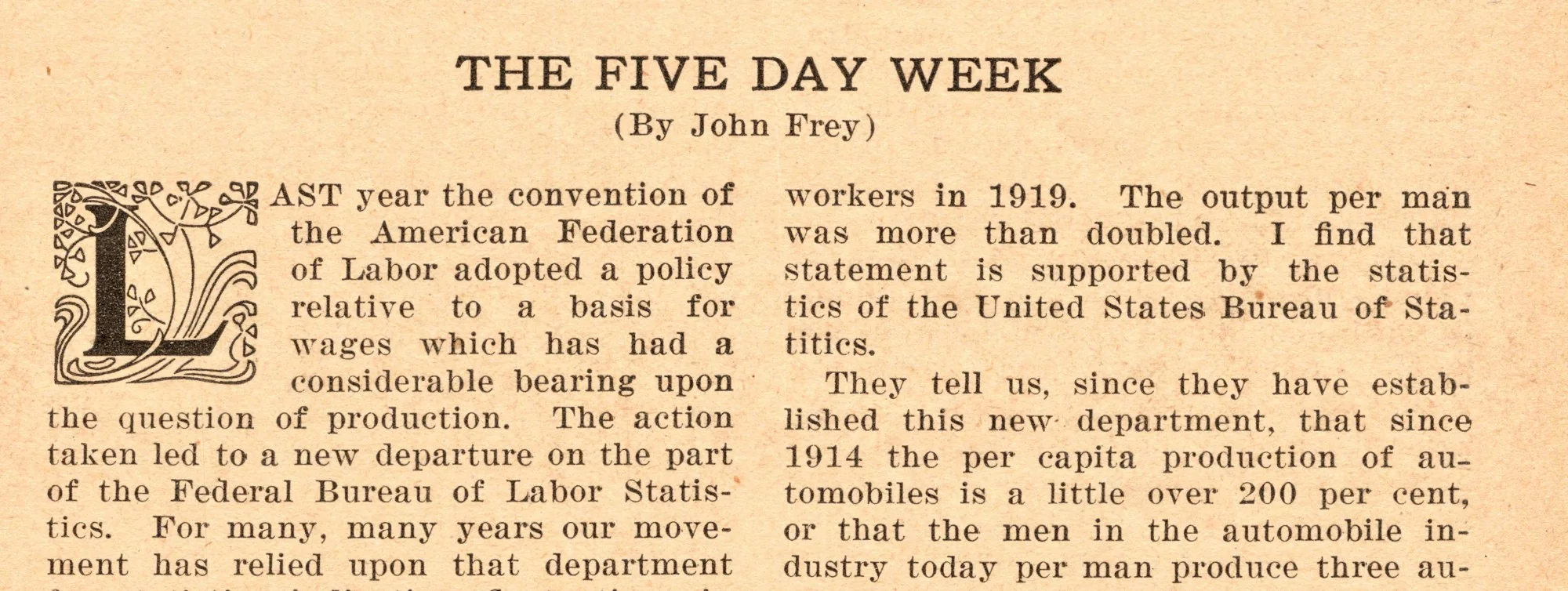
"The Five Day Week," December 1926, page 31
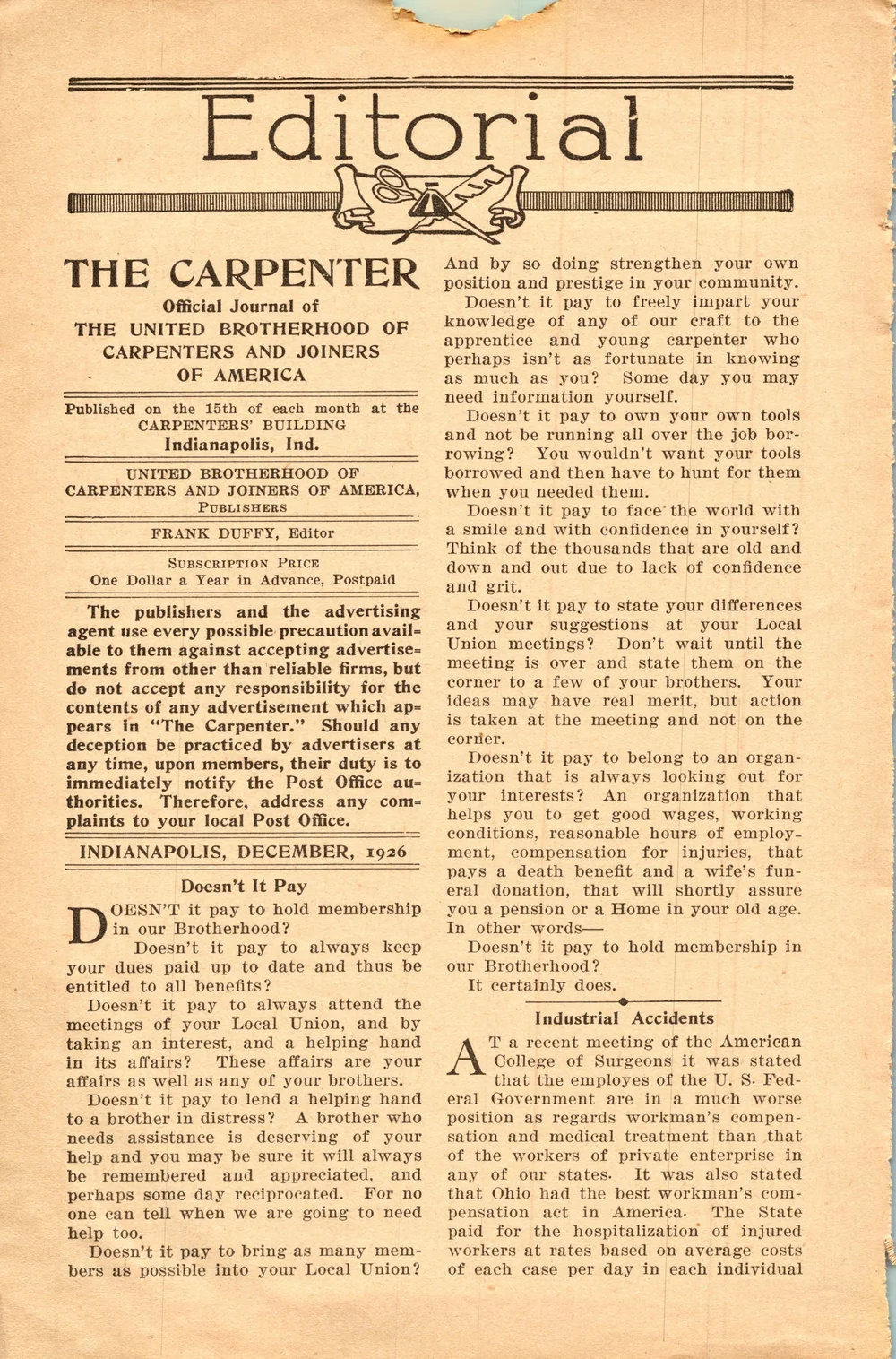
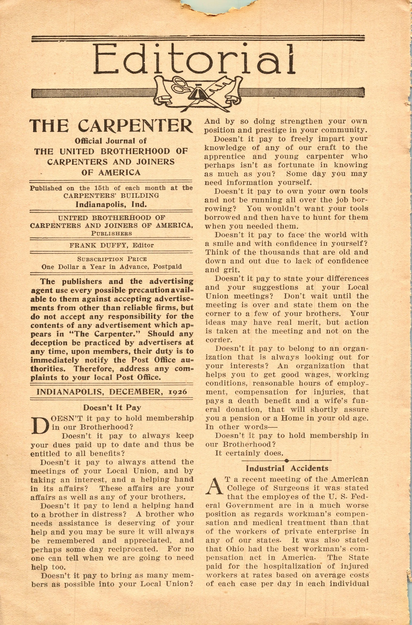
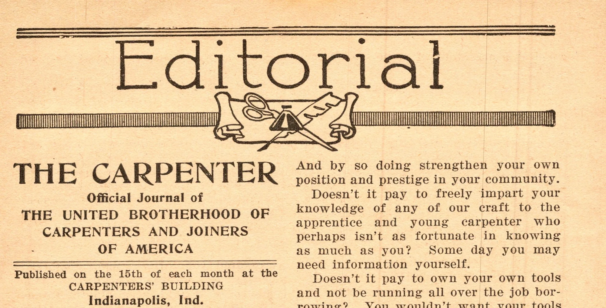
Editorial page, December 1926
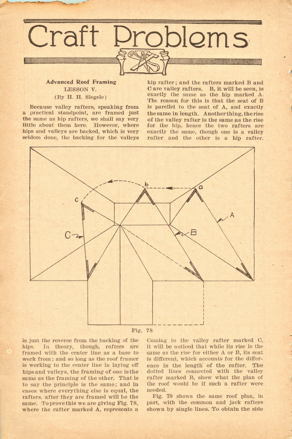
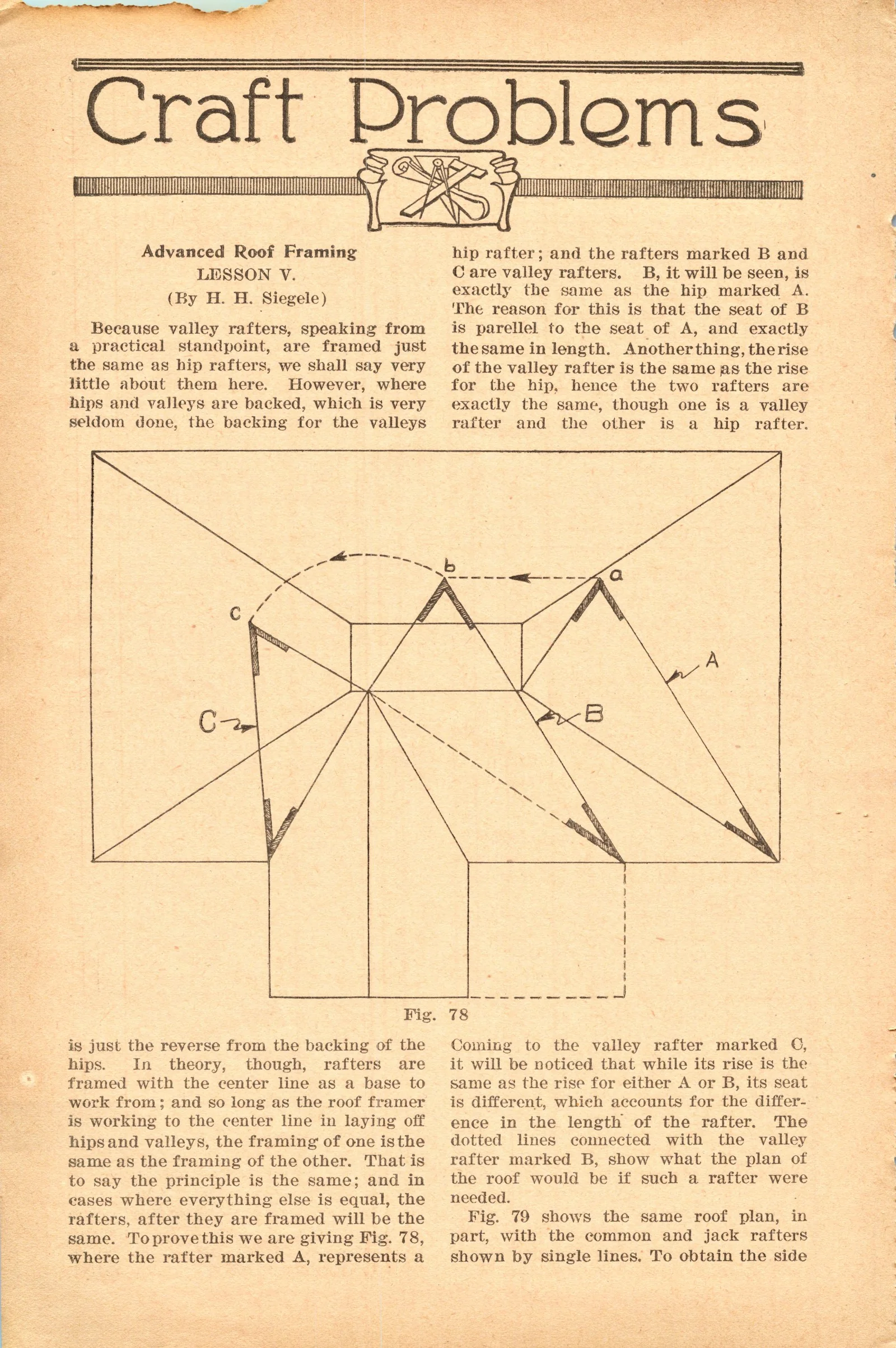
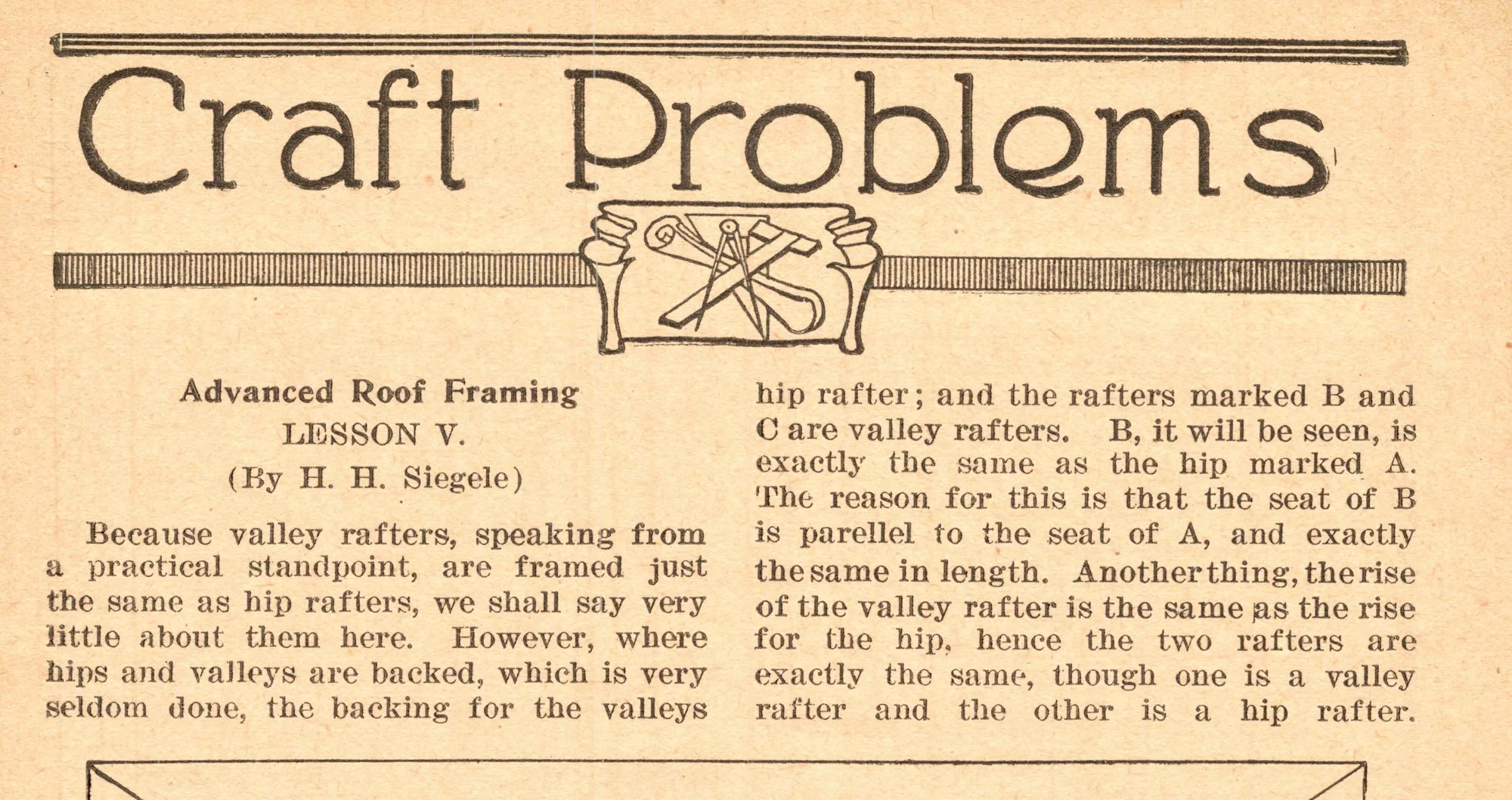
"Craft Problems: Advanced Roof Framing," September 1927
Letter variants
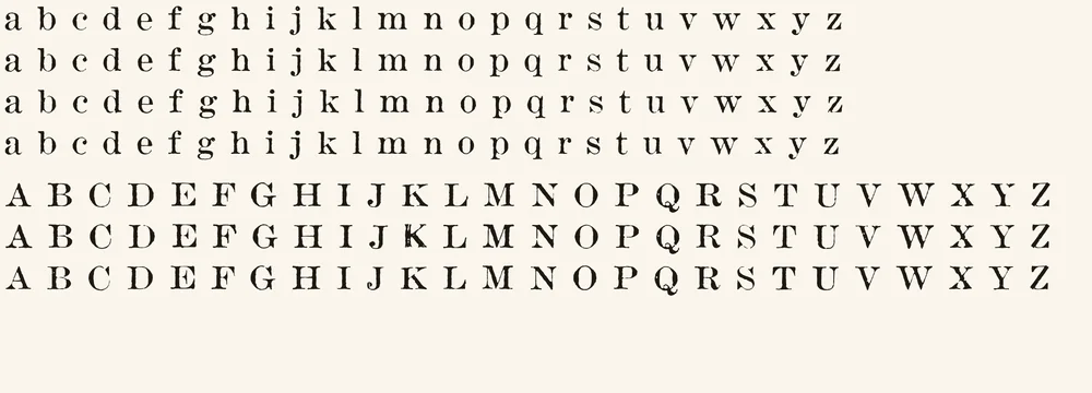
Four printed versions of every lowercase letter (three of q) and three of most capitals (two of K and V; one each of Q, X and Z, the rarest letters in the magazine). Each variant comes from a different page and was checked against its main letter’s weight.
| Feature | What it does | On by default |
|---|---|---|
| Contextual Alternates (calt) | Cycles each letter through its printed versions, based on the letter before it | Yes |
| Standard Ligatures (liga) | fi, ff, fl, ffi and ffl joined as in the magazine | Yes |
| Stylistic Set 1 (ss01) | Switches every letter to its 2nd version | No |
| Stylistic Set 2 (ss02) | Switches every letter to its 3rd version | No |
| Stylistic Set 3 (ss03) | Switches lowercase to its 4th version | No |
Character set
94 characters and 221 glyphs, counting the letter variants and ligatures. Select a character to try all its versions in the tester.
Not included
- Accented letters (é è à ñ ü ç and others)
- § ¶ † ‡ (section and footnote marks)
- £ ¢ ½ ¼ ¾ © ° + ×
- Bold and italic styles
If you type a character Plumb Bob doesn’t have, your app borrows it from another font.
Where each glyph came from
204 of Plumb Bob’s 218 drawn glyphs are real impressions from the magazine. The other 14 were rebuilt because the magazine never prints them; drawn parts use stroke widths measured from the real letters and the same mottled ink texture.
- Straight from the magazine’s body text
- a–z, A–Y except X, 0–9, . , ; : ! ? ‘ ’ “ ” ( ) - — $ & =, the ligatures fi ff fl ffi ffl, and every letter variant
- From a heading, scaled to text size
- X (from "EXECUTIVE")
- Rebuilt from the magazine’s own printed parts
- Z (the E’s top arm and the L’s foot with a drawn diagonal), – en dash (both ends of the em dash), … ellipsis (three real periods), • and · (real periods, raised), % (the magazine’s zeros with a drawn slash), @ (the magazine’s a with a drawn ring)
- Drawn to match
- / slash, * asterisk, # number sign, [ ] brackets, straight ' and "
How it was made
Nearly every glyph is a real impression from the page, not a redrawing. Instead of averaging many copies of a letter into one clean shape, the process picks the single most typical real example, so each glyph keeps its own ink spread, nicks and slight tilt.
- Scanned each page at 1200 dpi, straightened it and evened out the paper tone.
- Read the text with OCR and split every word into its individual letters, checking that each word split into the right number of letters.
- Measured each line’s baseline, so every letter keeps its true height.
- For each character, ranked thousands of real examples and picked the most typical one, plus up to three more from different pages for the variants.
- Traced each chosen letter into smooth vector outlines at the scan’s full resolution, shaving a fraction of a pixel to offset the spread of the grey 1920s ink.
- Measured the gaps between letters across both issues and solved for each letter’s spacing; set at the magazine’s size, Plumb Bob matches the original’s line length to within about 1%.
- Checked every glyph by eye, including the weight of each variant against its main letter.
More about how the fonts are made
Historical note
The original type is most likely Ionic No. 5, a newspaper face designed by Chauncey H. Griffith and released by the Mergenthaler Linotype Company in 1925.1 Set beside Linotype’s own specimen of the face, the magazine’s type shares its unusually large x-height and short ascenders, its low contrast, its short, sturdy bracketed serifs and ball ends, and the same set of ligatures, ffl included.2 One letter differs: the magazine’s J drops below the line, while the specimen’s sits on it. That could be an alternate matrix or a close relative from another maker, so our confidence is good rather than certain. Century Expanded, the other usual choice for 1920s magazines, has longer ascenders and more contrast and does not fit.
Ionic No. 5 was the first of Linotype’s Legibility Group, a family of newspaper faces built to stay clear under fast presses, stereotyped plates and cheap paper.3 It was an immediate success: within about 18 months of its release it was in use at nearly 3,000 newspapers around the world.4 Griffith followed it with Excelsior, Paragon, Opticon and Corona.5
The Carpenter was the official journal of the United Brotherhood of Carpenters and Joiners of America, published monthly from the union’s headquarters in Indianapolis. In the issues used here, edited by Frank Duffy, the union argued for the five-day week and for buying only union-made goods, alongside practical lessons in roof framing for its members.
Sources
- Ionic No. 5, Wikipedia
- Specimen Book of Linotype Faces (Ionic No. 5, pp. 515–524), Mergenthaler Linotype Company, 1939, via Internet Archive
- Legibility Group, Wikipedia
- Ionic N°5 Font Field Guide, MyFonts
- Chauncey H. Griffith, Wikipedia
Printable type specimen
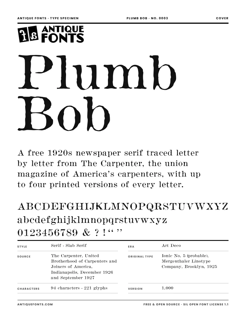
A six-page specimen of Plumb Bob to print or keep: the full character set, every printed version of each letter, text set at the size used in the original magazine, and the story of its source.
US Letter, ready to print.
Specifications
- Formats
- OTF (CFF outlines) and TTF
- Units per em
- 1000
- x-height / cap height
- 509 / 694
- Default line spacing
- 1.15 em, close to the magazine’s 8 on 9 pt
- Kerning
- None, as in the original Linotype slugs; spacing is measured from the magazine
- Best sizes
- 8–12 pt for text that looks like the magazine; larger, the soft grey edges become the feature
- Version
- 1.000
- Released
- November 21, 2026
In the download
- PlumbBob-Regular.otf (118 KB)
- PlumbBob-Regular.ttf (162 KB)
- OFL.txt (the license)
- README.txt
License
Free · Open source · SIL Open Font License 1.1
Plumb Bob is free for personal and commercial use. Use it in logos, books, packaging, websites, apps, videos, anything. You may share it, change it and bundle it with your own work.
The only thing you can’t do is sell the font files on their own. Changed versions must stay under the same license.
Credit isn’t required, but a link back to antiquefonts.com is greatly appreciated. And if you make something with Plumb Bob, we’d love to see it: email [email protected].
Questions
- Can I use Plumb Bob commercially?
- Yes. Plumb Bob is free for personal and commercial projects: logos, books, packaging, websites, anything. The one thing you can’t do is sell the font files themselves.
- Why do the letters look soft and uneven?
- On purpose. Every glyph is a real impression from 1920s magazine printing, grey ink and all.
- Why does the same letter look different each time?
- Plumb Bob rotates through up to four printed versions of each letter. Turn off Contextual Alternates in your app to use only the main version.
- Is every character original?
- Almost. 204 glyphs come straight from the magazine; the Z, a few symbols and some punctuation the magazine never printed were rebuilt from its own letters or drawn to match. The full list is above.
- Is this the same as Ionic No. 5?
- No. Plumb Bob is traced from the printed page, with the press’s ink spread and wear, rather than redrawn from the original design. Ionic N°5 is a trademark of Monotype, which sells its own digital revival.
- Which apps show the letter variants?
- Any app with OpenType support: Adobe Illustrator, InDesign and Photoshop, Affinity, Figma and recent versions of Word. Apps without OpenType support show only the main version of each letter.
Cite this font
Plumb Bob (version 1.000). Font digitized by AntiqueFonts.com from The Carpenter (Indianapolis: United Brotherhood of Carpenters and Joiners of America, December 1926 and September 1927). AntiqueFonts.com, no. 0003. https://antiquefonts.com/fonts/plumb-bob/