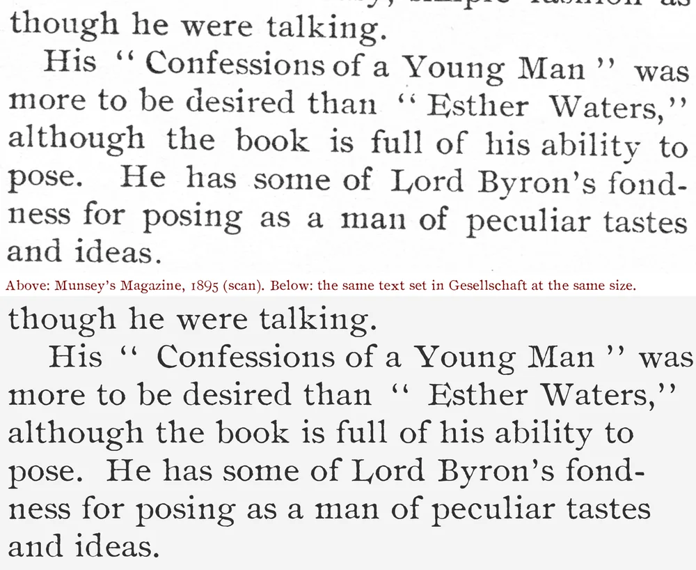
Gesellschaft
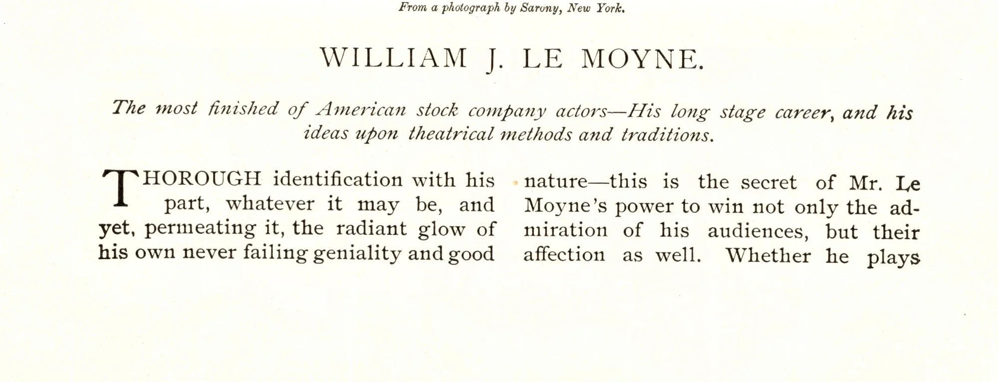
A free 1890s old style traced letter by letter from Munsey’s Magazine, with old-style figures, a sweeping L and four printed versions of every lowercase letter.
- Era
- Victorian (1837–1901)
- Source
- Munsey’s Magazine, April 1895
- Original type
- Ronaldson Old Style
MacKellar, Smiths & Jordan, Philadelphia, 1884 (or one of its copies) - Best for
- Text face
- Characters
- 93 · 222 glyphs
- Features
- Letter variants, ligatures
- Version
- 1.000 · November 21, 2026
- License
- SIL Open Font License
- Downloads
- 0
OTF + TTF · 162 KB zip · Free for personal & commercial use
Try it in the type tester PDF type specimen · 1.4 MB Cite this fontFree and open source. A link back to antiquefonts.com is greatly appreciated, and we’d love to see what you make: [email protected].
Try Gesellschaft
Type anything below, or pick a sample.
- 14 PX
- 18 PX
- 24 PX
- 36 PX
- 48 PX
Each letter rotates through the printed versions found in the magazine, so repeated letters never look identical. Characters Gesellschaft doesn’t include will show in a fallback font.
About Gesellschaft
Gesellschaft comes from the April 1895 issue of Munsey’s Magazine, the ten-cent New York monthly that became one of the best-selling magazines of its day. Its book reviews, theatre notes and profiles were set in Ronaldson Old Style, a lively American old style cut in Philadelphia in 1884, with beak-shaped serifs, an L whose foot sweeps under the next letter, and figures that rise and fall like lowercase. Every letter was scanned at 1200 dpi and traced from a real impression on the page, and up to four different printed copies of each letter rotate automatically as you type.
The source
- Title
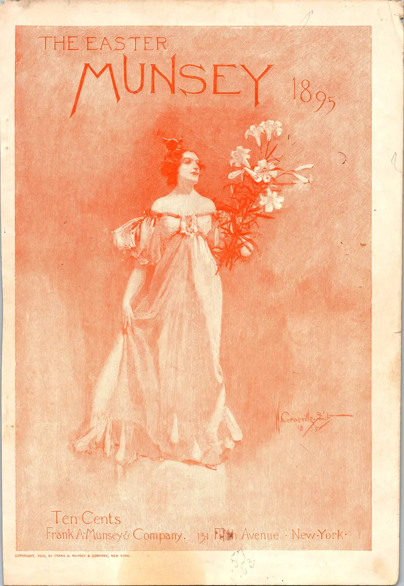
- Munsey’s Magazine. April 1895, the Easter number
- Publisher
- Frank A. Munsey & Company
- Place
- New York
- Date
- April 1895
- Type
- Magazine
- Original size
- 8 pt (Brevier) on about 9¼ pt lines
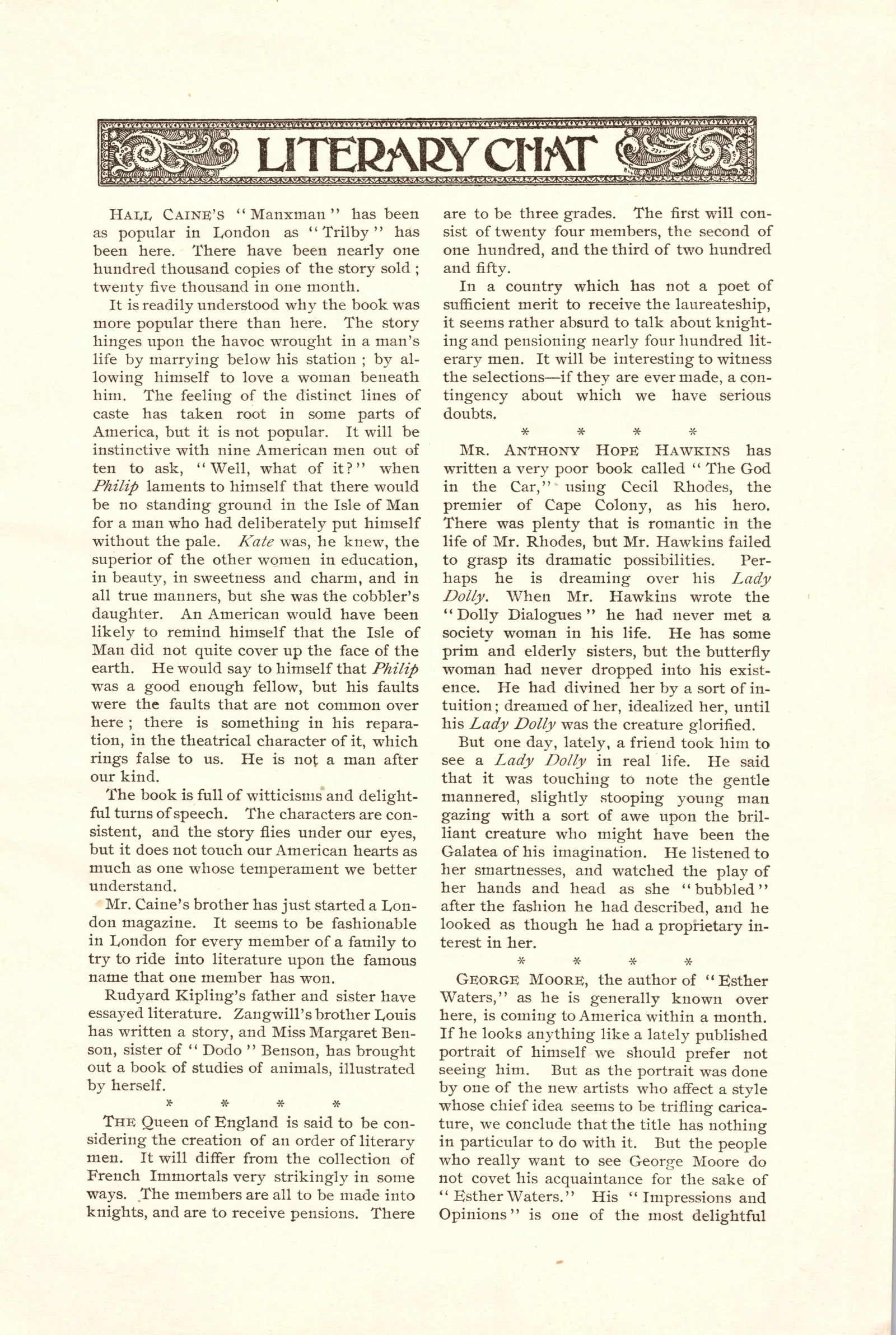
A general monthly of fiction, portraits, art and theatre, sold for ten cents from Frank A. Munsey & Company at 151 Fifth Avenue, New York. The April 1895 Easter number carries departments such as "Literary Chat," "The Stage" and "Impressions by the Way," profiles of actors and writers, and pages of halftone portraits, many credited to the Berlin Photographic Company. The text is printed in crisp black ink on smoother paper than the cheap books of the time, to carry the halftone portraits, which is why Gesellschaft looks sharper and lighter than a book face like Kester.
See the cover, advertisements and portraits from this issue on AntiqueAdvertisements.com
- Pages scanned62, at 1200 dpi
- Text sizes in the issue8 pt and about 9 pt
- Built fromThe 8 pt text
- Real printed glyphs206 of 219
From the magazine
Pages from the original, straightened and evenly lit. Select a page to see it full size.
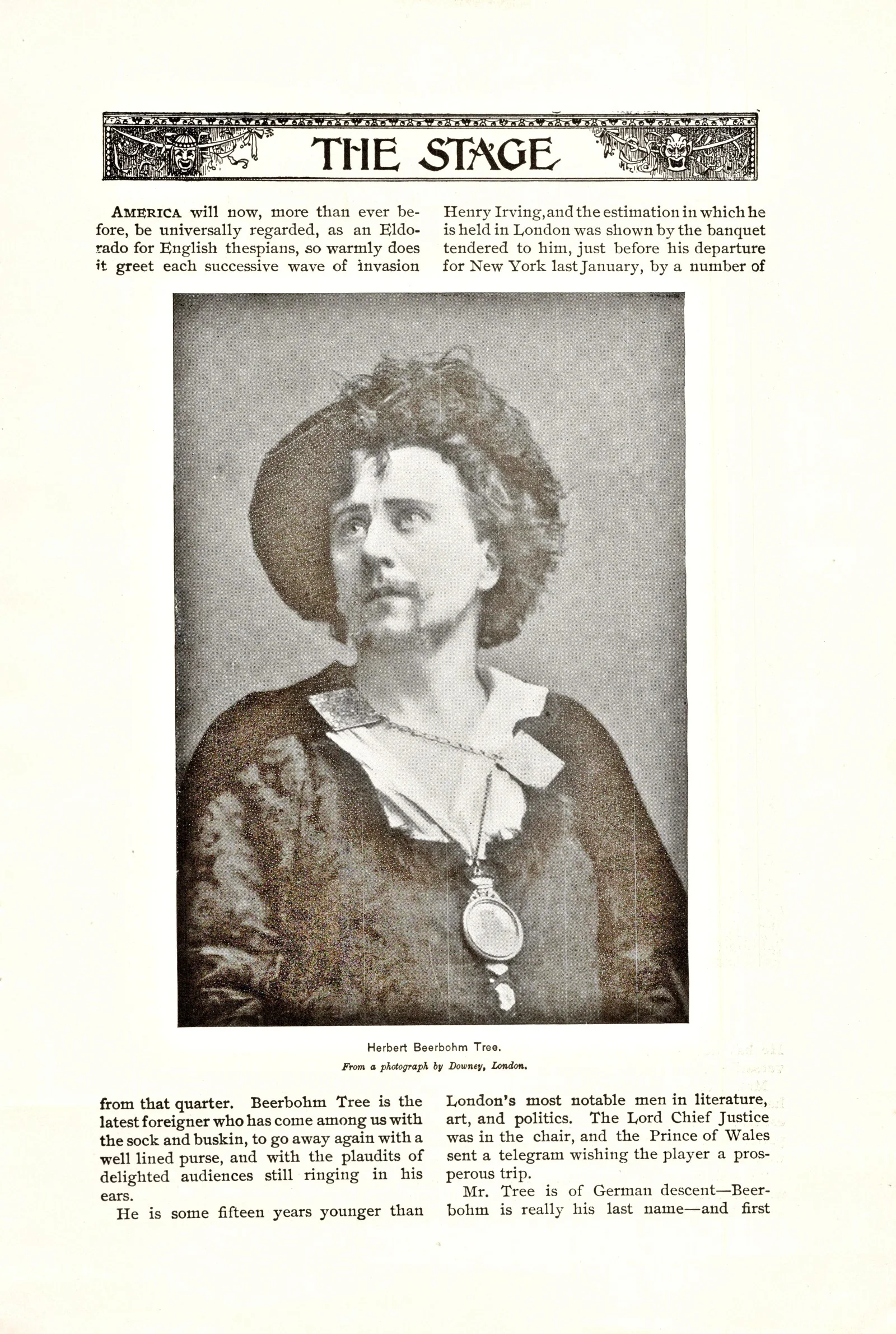
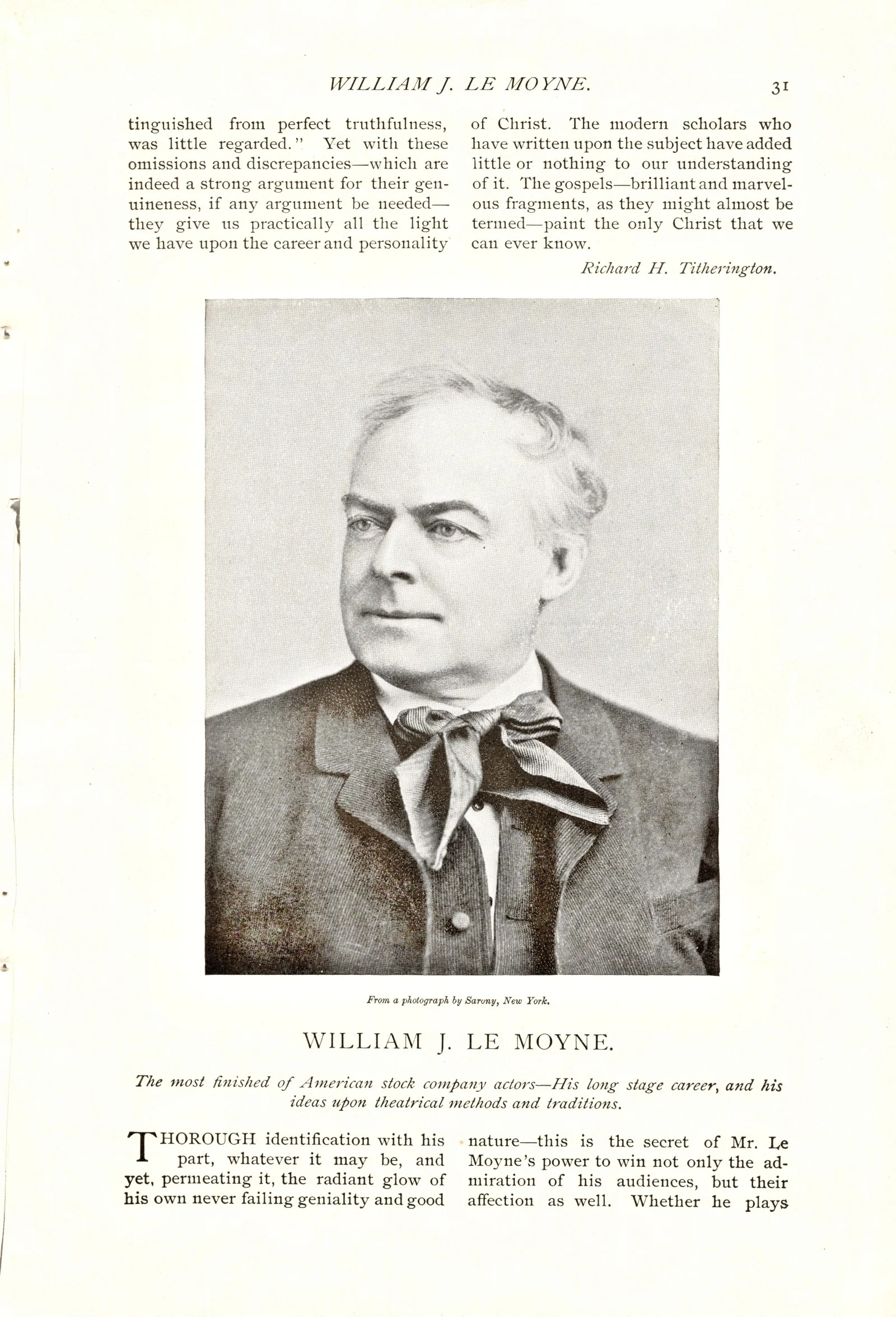
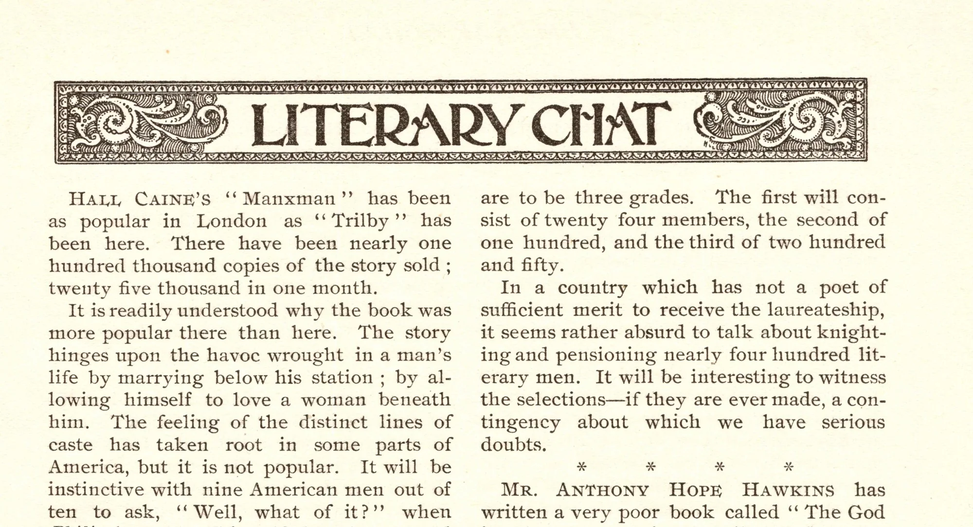
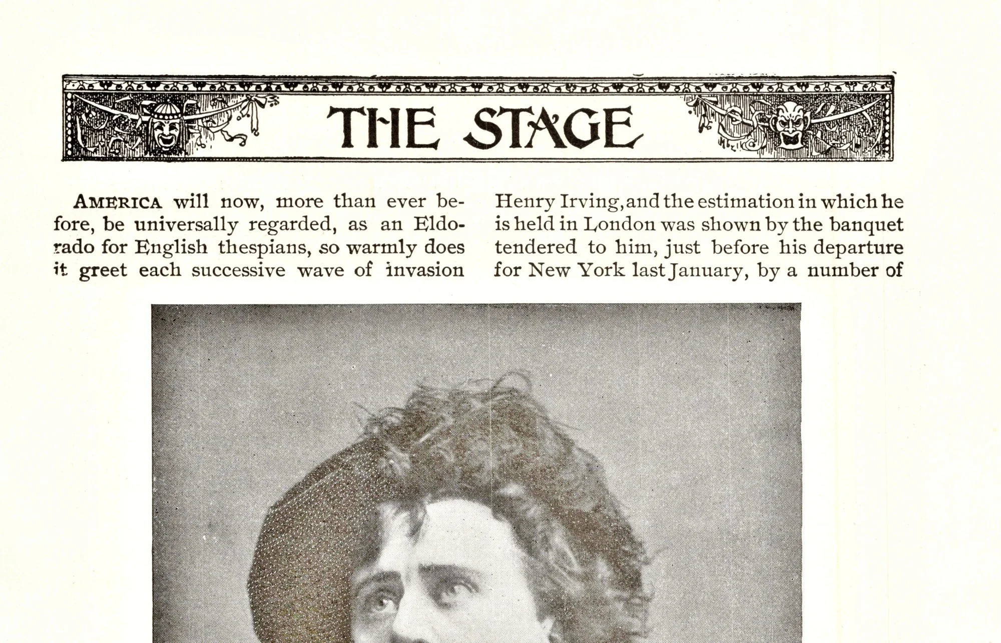
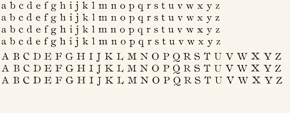
Letter variants
Four printed versions of every lowercase letter (three of j, q, z and é) and three of most capitals (two of U; one each of Q and X, which appear only once in the whole issue). Each variant comes from a different page and was checked against its main letter’s weight.
| Feature | What it does | On by default |
|---|---|---|
| Contextual Alternates (calt) | Cycles each letter through its printed versions, based on the letter before it | Yes |
| Standard Ligatures (liga) | fi, ff, fl and ffi joined as in the magazine | Yes |
| Stylistic Set 1 (ss01) | Switches every letter to its 2nd version | No |
| Stylistic Set 2 (ss02) | Switches every letter to its 3rd version | No |
| Stylistic Set 3 (ss03) | Switches lowercase to its 4th version (capitals have 3) | No |
Character set
93 characters and 222 glyphs, counting the letter variants and ligatures. Select a character to try all its versions in the tester.
Not included
- & ampersand: the issue has no clean one to trace
- Accented letters other than é
- § ¶ † ‡ (section and footnote marks)
- £ ¢ ½ ¼ ¾ © ° + = ×
- The ffl ligature
- Bold and italic styles (the magazine has a matching italic, a possible future font)
If you type a character Gesellschaft doesn’t have, your app borrows it from another font.
Where each glyph came from
206 of Gesellschaft’s 219 drawn glyphs are real impressions from the magazine. The other 13 were rebuilt because the issue never prints them; drawn parts use stroke widths measured from the real letters, thinned to match the magazine’s lighter, higher-contrast type.
- Straight from the magazine’s text
- a–z, A–Z, 0–9 (old-style figures), é, . , ; : ! ? ‘ ’ “ ” ( ) - — $, the ligatures fi ff fl ffi, and every letter variant
- From the magazine’s slightly larger 9 pt pages, scaled to match
- a few characters too rare in the 8 pt text
- Rebuilt from the magazine’s own printed parts
- – en dash (both ends of the em dash), … ellipsis (three real periods), • and · (real periods, raised), % (the magazine’s zeros with a drawn slash), @ (the magazine’s a with a drawn ring)
- Drawn to match
- / slash, * asterisk, # number sign, [ ] brackets, straight ' and "
How it was made
Nearly every glyph is a real impression from the page, not a redrawing. Instead of averaging many copies of a letter into one clean shape, the process picks the single most typical real example, so each glyph keeps its own ink spread, nicks and slight tilt.
- Scanned each page at 1200 dpi, straightened it and evened out the paper tone.
- Read the text with OCR and split every word into its individual letters, checking that each word split into the right number of letters.
- Sorted the lines by size: the issue mixes 8 pt and about 9 pt text in the same typeface, so the font is built from the 8 pt lines, and only a few rare characters were taken from the larger pages and scaled to match.
- Measured each line’s baseline, so every letter keeps its true height, including the old-style figures that drop below the line.
- For each character, ranked thousands of real examples and picked the most typical one, plus up to three more from different pages for the variants.
- Traced each chosen letter into smooth vector outlines at the scan’s full resolution.
- Measured the gaps between letters and words across the 8 pt pages and solved for each letter’s spacing, then spaced the rarely seen capitals by shape so all-capital words set evenly.
- Checked every glyph by eye, including the weight of each variant against its main letter.
More about how the fonts are made
Historical note
The type is Ronaldson Old Style, cut in 1884 for the Philadelphia foundry MacKellar, Smiths & Jordan, or one of the copies other foundries made of it.1 Set beside the foundry’s own 1892 specimen, the letters match: the L whose foot sweeps under the next letter, the beak-shaped serifs on E, F and T, and old-style figures with a 1 shaped like a small capital I.2 A standard type encyclopedia notes that Linotype’s plainer Old Style No. 1 could be turned into Ronaldson by changing just seven capitals, C, E, F, G, L, S and T, which is why those letters are the ones to look at.3
Its designer, Alexander Kay, was a Scottish-born punchcutter who had cut type in London for John Skirving before joining the Philadelphia foundry L. Johnson & Co. in 1854, where he changed his name from MacKaye to Kay. Of the many faces he cut there, Binny Old Style and Ronaldson Old Style are the best known.4 Ronaldson is named after James Ronaldson, who with Archibald Binny founded Binny & Ronaldson in Philadelphia in 1796, the first significant American type foundry and the ancestor of MacKellar, Smiths & Jordan.5
Munsey’s Magazine was the magazine that proved a ten-cent price could pay: Frank Munsey cut it from twenty-five cents to ten in 1893, and the circulation that followed brought in the advertising that made it profitable.6 By 1895, the year of this issue, it was selling over half a million copies a month.7
The font’s name comes from the photo credits. Many of the issue’s portraits and art plates are credited to the Berlin Photographic Company, the English name of the Photographische Gesellschaft, an art-reproduction publisher founded in Berlin in 1862 with branches in London, New York and Paris. Gesellschaft is simply German for company or society. The firm’s own run ended in 1927.8
Sources
- Alexander Kay, Luc Devroye, Type Design Information Page
- Specimens of Printing Types (Ronaldson Series, pp. 90–94), MacKellar, Smiths & Jordan Co., 1892, via Internet Archive
- Old Style No. 1, Fonts In Use
- Alexander Kay, MyFonts
- Binny and Ronaldson, MyFonts
- Munsey’s Magazine, Wikipedia
- Frank Munsey, Wikipedia
- Photographische Gesellschaft. Berlin, Bibliothèque nationale de France
Printable type specimen
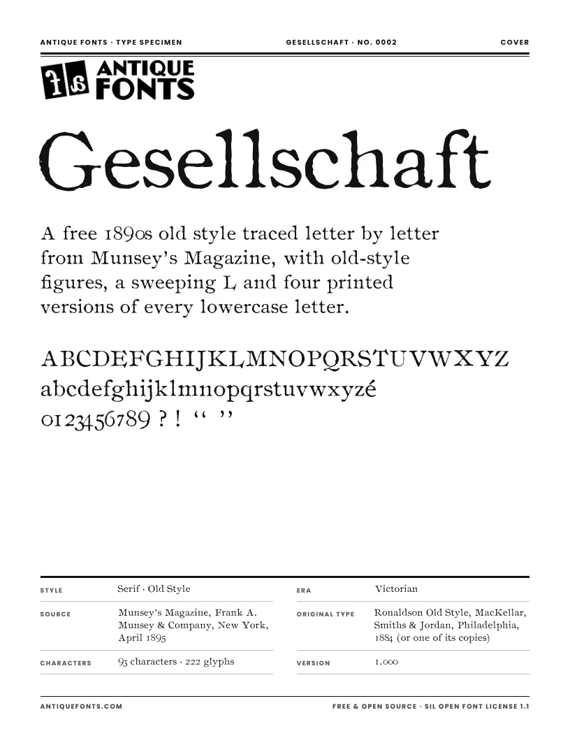
A six-page specimen of Gesellschaft to print or keep: the full character set, every printed version of each letter, text set at the size used in the original magazine, and the story of its source.
US Letter, ready to print.
Specifications
- Formats
- OTF (CFF outlines) and TTF
- Units per em
- 1000
- x-height / cap height
- 469 / 675
- Figures
- Old style: 3, 4, 5, 7 and 9 drop below the line, 6 and 8 rise above x-height
- Default line spacing
- 1.16 em, matching the magazine’s 8 pt on about 9¼ pt
- Kerning
- None, as in the original metal type; spacing is measured from the magazine
- Best sizes
- 8–14 pt for text that looks like the magazine; larger, the sweeping L and beaked serifs become the feature
- Version
- 1.000
- Released
- November 21, 2026
In the download
- Gesellschaft-Regular.otf (108 KB)
- Gesellschaft-Regular.ttf (150 KB)
- OFL.txt (the license)
- README.txt
License
Free · Open source · SIL Open Font License 1.1
Gesellschaft is free for personal and commercial use. Use it in logos, books, packaging, websites, apps, videos, anything. You may share it, change it and bundle it with your own work.
The only thing you can’t do is sell the font files on their own. Changed versions must stay under the same license.
Credit isn’t required, but a link back to antiquefonts.com is greatly appreciated. And if you make something with Gesellschaft, we’d love to see it: email [email protected].
Questions
- Can I use Gesellschaft commercially?
- Yes. Gesellschaft is free for personal and commercial projects: logos, books, packaging, websites, anything. The one thing you can’t do is sell the font files themselves.
- How do you say Gesellschaft?
- Roughly guh-ZELL-shaft. It’s the German word for company, taken from the Berlin photo publisher credited under many of the magazine’s portraits.
- Why do the numbers look uneven?
- They are old-style figures, as printed in the magazine: some drop below the line and some rise above the lowercase, so numbers blend into text instead of standing out like capitals.
- Why does the same letter look different each time?
- Gesellschaft rotates through up to four printed versions of each letter. Turn off Contextual Alternates in your app to use only the main version.
- Is every character original?
- Almost. 206 glyphs come straight from the magazine; a few symbols and some punctuation the issue never printed were rebuilt from its own letters or drawn to match. The full list is above. There is no ampersand yet.
- Is this the same as Ronaldson from Canada Type?
- No. Canada Type’s Ronaldson is a modern redrawing of the 1884 design. Gesellschaft is traced from one printed magazine, with the ink, wear and size-specific shapes of the 8 pt metal type.
- Which apps show the letter variants?
- Any app with OpenType support: Adobe Illustrator, InDesign and Photoshop, Affinity, Figma and recent versions of Word. Apps without OpenType support show only the main version of each letter.
Cite this font
Gesellschaft (version 1.000). Font digitized by AntiqueFonts.com from Munsey’s Magazine (New York: Frank A. Munsey & Company, April 1895). AntiqueFonts.com, no. 0002. https://antiquefonts.com/fonts/gesellschaft/